Objective
Our task is to find a large data set with both numerical and qualitative data to create visuals to analyze the data. With this data set, we will define four meaningful questions and create one time-series plot, one bar chart, one histogram, and one scatter plot.
Team Members:
Data Provided
The dataset we found included the following columns:
Time and Schedule Information
Schedule Date: MM/DD/YYYY date of game
Schedule Season: Year
Schedule Week: Weeks 1-17 of the corresponding season
Schedule Playoff: True or False
Team Information
Home Team
Home Team Score
Away Team
Away Team Score
Betting Information
Favored Team: ID/Abbreviation of the team favored to win
Spread: How many points the favorite is expected to win by
Over Under Line: Total points expectation for the game
Game Location and Conditions
Stadium: Which stadium the game was played at
Stadium Neutral: True or false
Temperature: In degrees Fahrenheit
Wind: In MPH, how strong of wind experienced during the game
Humidity: How humid conditions were during the game
Weather Detail: Indoor, outdoor (if left blank), rain, snow, fog, etc.
Data Manipulation
With the given data, we created the following columns to make our analysis easier:
Winning Team: Based on if home team score > or < away team score; Makes it possible to find count of wins per team
Home or Away Win: If Winning Team = Home Team; Allows for a count of how many home or away wins
Margin of Victory: Absolute value of the difference between home score and away score
Analysis and Visuals
How does the over/under line change for the Green Bay Packers as the season progresses?
Data Used: Over Under Line, Filter by Green Bay Packers in Home or Away Team Column, and Schedule Season (2000)
Our team wanted to examine the pattern in the over/under lines in order to visualize how the betting expectations change week by week. A higher line means that analysts expect a high-scoring game, which could be due to strong offenses or weak defenses. A lower line means the game is projected to have a lower total score, meaning both teams have strong defenses and can prevent a high amount of scores. To focus on this pattern for one team only, we chose the Green Bay Packers during the 2000 season.
We chose to create a time-series graph in order to compare how the over/under line varies by each week in a season.
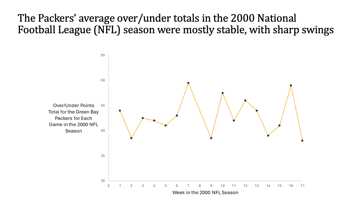
In Excel, we filtered the schedule season column of all the years to narrow the data to only show the 2000 season. We also filtered the home and away teams to only show games with the Green Bay Packers. The time series plot was created in Excel and we transferred it over to PowerPoint where we renamed the axes, changed the colors to match the Packers, and created the assertion.
How do field and weather conditions affect the percentage of games won by the home team?
Data Used: Weather Detail, Home or Away Win
Depending on weather, some teams may have a large home-field advantage. For example, if a team travels somewhere cold and must play in snowy conditions that they are not used to, would this lead to the home team being more likely to win? This is interesting because some teams may not adapt well to super cold air or super hot summers.
We chose to create a bar graph to represent the amount of home vs away wins for each field condition.
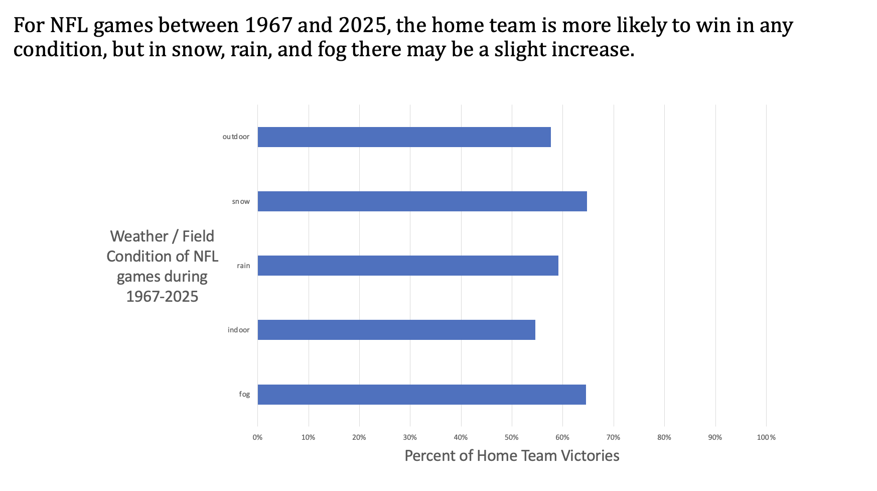
This visual was created by creating a column that classifies each game by whether the home or away team won. Then, a pivot table was created with that column and the weather detail column. Categories with fewer than 30 entries were removed from the chart in order to prevent harsh biases. A pivot chart was used to create a bar chart that would display the number of home wins as a percentage of row total.
What is the statistical distribution of the spread of post season games?
Data Used: Spread, Schedule Playoff
Our team wanted to see if there was a pattern of if playoff games are predicted to be a close and competitive game or if there is a clearly favored winner. To see what spreads were most commonly projected, we created a histogram.
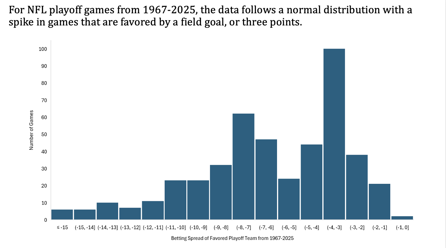
In Excel, we filtered using the Schedule Playoff column to only include the playoff games. We also filtered to remove any games that did not have the data for the spread. After making a histogram of the spread, we changed the bin width to include games that have an extra half point since spreads can be whole or decimal numbers.
How does the temperature affect the margin of victory?
Data Used: Margin of Victory, Temperature
Our team wanted to see if there is a pattern between temperature and margin of victory. In extreme temperatures, such as freezing or extreme heat, it could make a difference in if a game is close or if one team pulls away for a large advantage. For this question, we narrowed the data down to games between 2010 and 2015 to create a scatterplot comparing margin of victory and game temperature.
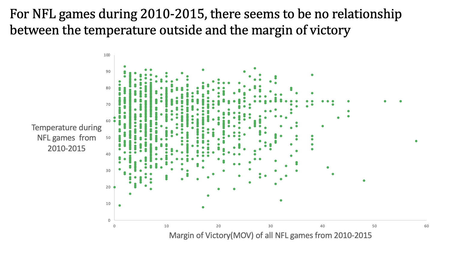
We created the margin of victory column and filtered the data to only include games between 2010 and 2015. The visual was created by making a scatterplot with the margin of victory column and game temperature. We removed the gridlines and made the points smaller in order to better display the distribution.